MedNews Case Study 1

Case Study: Startup MedNews

The Brief

To create a brand for a new online news site for Australian/NZ medicines industry, MedNews. Our clients wanted a brand that would reimagine the future of medicines and how people want to receive their communications. The industry is quite conservative but the client wanted something simple, clean, fun and modern.


The Strategy

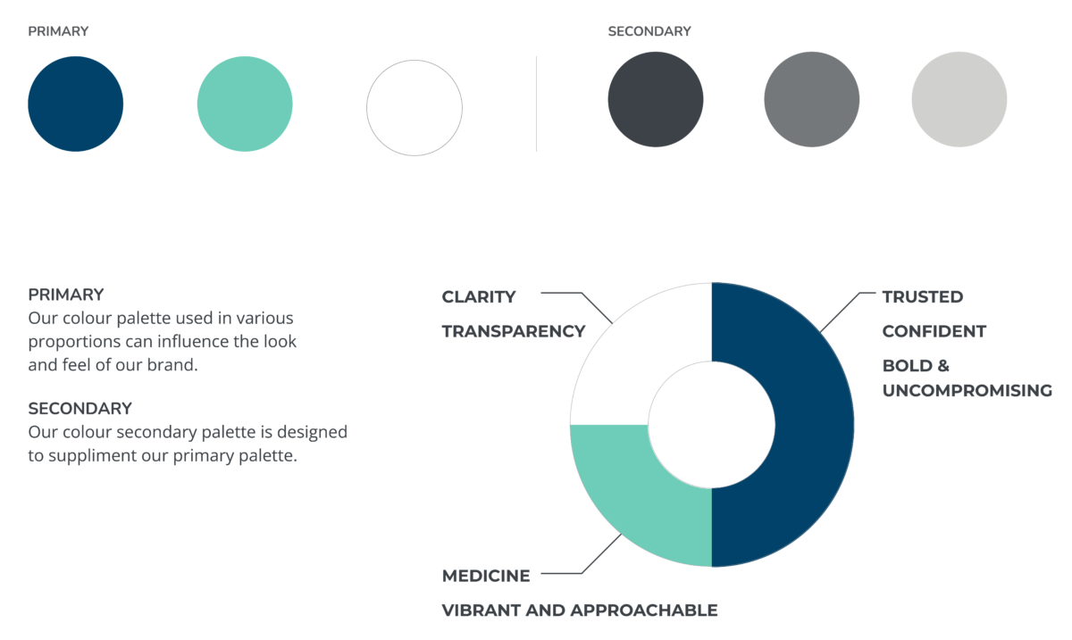
After working through our Brand Burger process we were able to identify 3 keywords that our client wanted their customers to think or feel after using their services – Informed, Connected, Patient

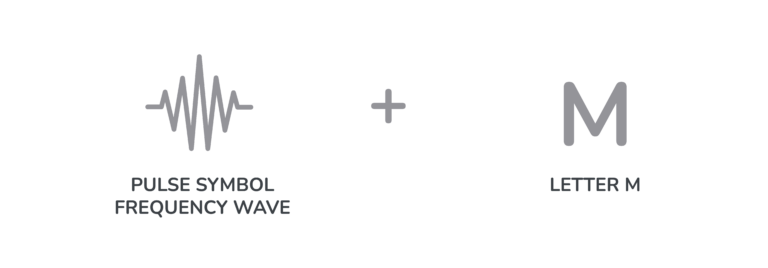
As part of their brand strategy, we wanted to create a strong brand that whilst still appealing the conservative aspects of the industry, would also have an element of freshness to it.  We also wanted to add an element that would represent the client herself and that she was a strong female leader in the industry.

We love everything about our logo and everyone who sees it tells us how much they love it. We also love our values and brand personality. It has made our storytelling much more simplified.

Megan Brodie – MedNews

Tagline

The client had already created their own tagline prior to engaging with Brand Burger – Your Industry Our Community

We used this tagline as our inspiration especially when selecting imagery. 

MedNews logo and tagline

The Logo

From 3 concepts, a preferred logo mark was chosen. The inspiration of this logo comes from combining the pulse symbol with the letter M. The pulse symbol represents heartbeat which is fundamentally associated with the medicines industry while the iconography also mimics a frequency wave wave which represents broadcasting and news.

The logo design embodies a sense of relevancy and timeliness by being ‘on-the-pulse’ and the boldness of the typography conveys clarity, independence and bravery.

Brand Burger Casestudies MedNews Equation

The Colour Palette

The colours were inspired by some of the mood boards from the briefing process but the navy was chosen as in colour psychology it represents trust, and professionalism.

The aqua colour was used to add a sense of freshness to the logo and to represent the fresh perspective the client was looking to bring to the industry. It was also chosen as a slightly softer and more feminine colour to emanate the role of our client as a strong female leader in the industry.

Brand Burger Casestudies MedNews Colour

Brand Imagery

The people-oriented and emotive images were selected to reflect the target market of the publication as well as the emotional connection and sense of community and caring MedNews wanted to achieve. Photography was chosen over graphics as the main component of the brand expression, reflecting the values of MedNews and capturing positive, authentic moments.

We chose photography with turquoise and navy blue tones is to relate back to the primary colours of the colour palette.


MedNews Imagery 2 1
MedNews Imagery 1 1

Brand Burger helped us refine exactly what our value proposition was in building a new trade publication and where it would sit in the existing market. Our brand promise, values, personality and key messaging around our core purpose, all continue to provide the foundation for our ongoing marketing efforts.
We’re sure you will be as thrilled with the outcome as we are.

Megan Brodie – MedNews