Eyes by Design Case Study

Brand Refresh Case Study

The Brief

To refresh and modernise the current branding for Eyes by Design. The owners they felt they had outgrown the existing logo, and that it didn’t align with their recently renovated modern new premises. The owners were looking to grow their practice by attracting more clients, so that they may have more than one optometrist in store and less dependancy on themselves. The focus was to develop a tagline, logo, visual identity and style that would create a consistent look and feel. This would help with recognition and memorability for the target audience.

The Brand Refresh Strategy

The brand needed a more emotionally compelling visual and narrative. The existing brand identity didn’t adequately reflect the compassion and genuine care that the business owners have for people in the community. The design solutions also needed to be invigorating and illustrate the Eyes by Design brand vision.

After working through our Brand Burger process we were able to identify 3 keywords that our client wanted their customers to think or feel after using their services – Professional, Knowledgeable, Trusted

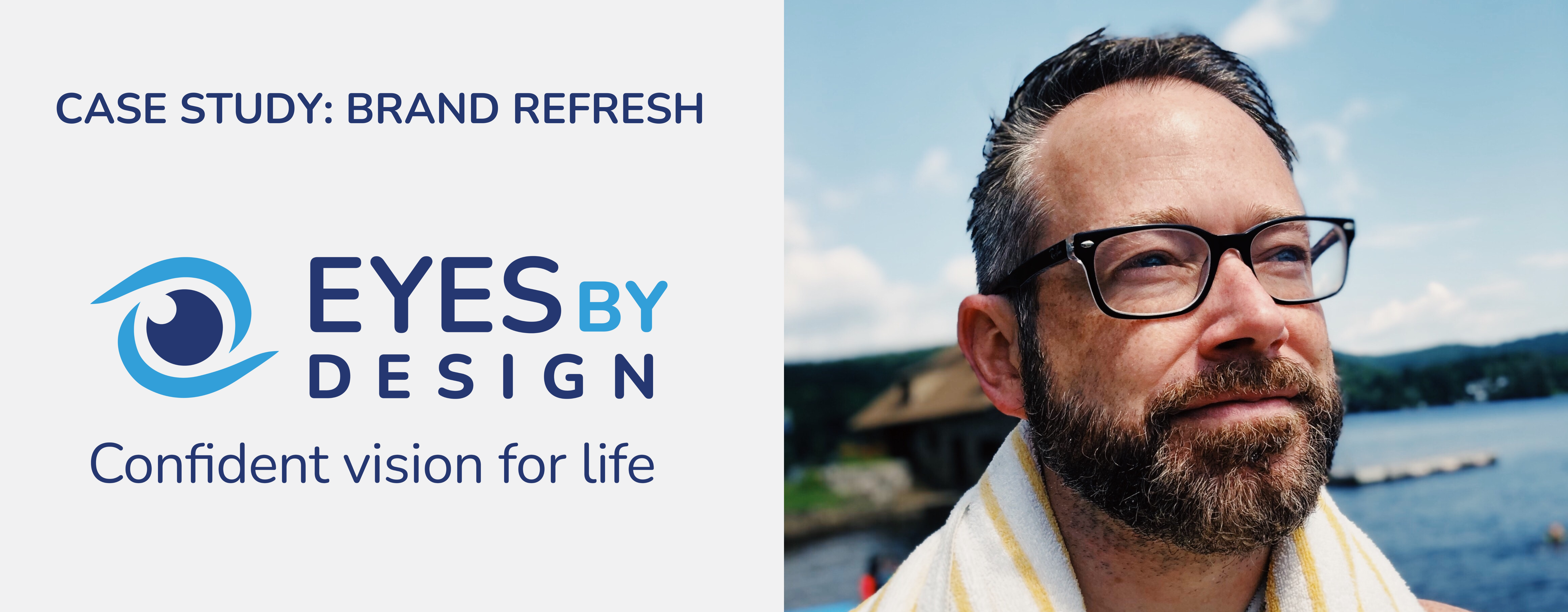
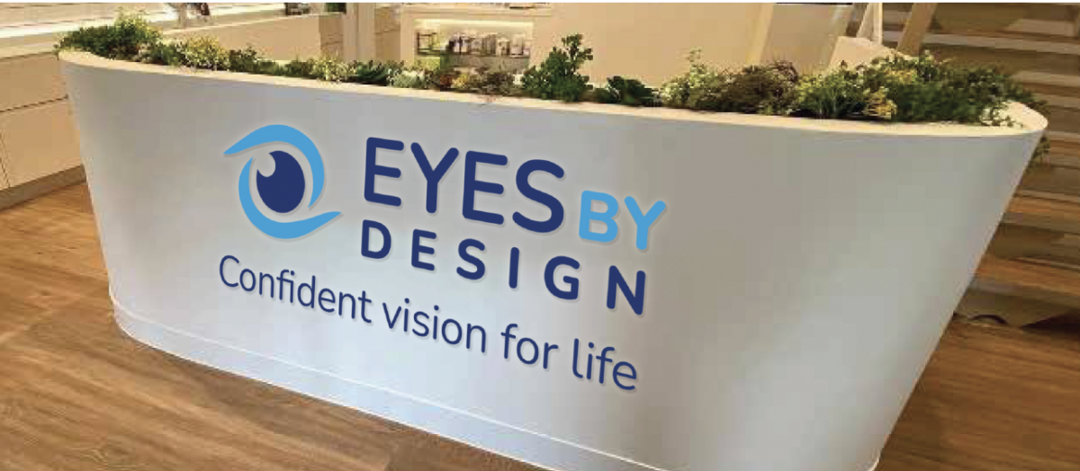
Although our clients hadn’t asked for us to develop a new tagline, as a result of our Brand Burger process and our discussion throughout the project, we felt there was a strong simple tagline that reflected the purpose of Eyes by Design.

The new tagline we created was – Confident Vision for Life

This aligned with the belief that Eyes by Design customers deserve outstanding eye care at every stage of life; no-one’s abilities should be limited by their vision. After using their services, their customers will enjoy freedom and confidence to live their life, knowing they are supported by professional optometrists. 

The reference ‘for life’ represents that the care is for every stage of their life but also for living their best life.

We found the process really helped us unlock what we really wanted with our brand and made us think about it in ways we otherwise would not have

Angela Altuneg – Eyes by Design

EyesByDesign Logo Tagline

The Logo Redesign

Eyes by Design’s logo was in need of a logo rebranding – it was outdated and didn’t align with the look of their new premises.

From 3 concepts, a preferred logo mark was chosen. It is an evolution from the previous logo, using the iris of the eye as the centre. The lighter blue curves were used the represent the coastal location of the business. The two curves also mimic the shape of two hands cupping the eye, representing the care Eyes by Design offer their customers.

The logo also had to work with existing signage within the store.

EBD Logo CMYK stacked
EyesByDesign Logo Tagline

ORIGINAL LOGO

NEW LOGO

Screen Shot 2022 08 02 at 9.39.06 pm
Screen Shot 2022 08 02 at 9.38.57 pm

SIGNAGE MOCK UP USING EXISTING STORE SIGNAGE

IN STORE MOCK UP OF EXISTING RECEPTION AREA

The Colour Palette

The colours were inspired by some of the mood boards from the briefing process along with the link to the coastal location of the business.

The dark blue represents professionalism and trustworthiness, whilst the lighter blue represents the blue of the ocean.

Colour Palette 1

Social Media Assets

Each Brand Burger includes monogram to be used in social media. For Eyes by Design we also created additional banners for Facebook. 

Eyes by Design Socials

Brand Imagery

Photography is a key component of the brand expression, capturing moments where peoples eyes do not hinder them from doing something that they love.

The demographic of age 30+ were chosen to represent their ideal clients. The images were obviously people and glasses oriented, where the person wearing a pair of glasses should be the focal point of the image.

The use of photography with blue and natural tones was recommend to reflect the coastal and natural environment where the business is located.

Eyes by Design Imagery

Brand Refresh

Result

A rebrand can be a great way to give an organisation a fresh start. It can help to update an older design that doesn’t quite connect with the intended audience, or it may reflect a significant change in a company or product. As a result of rebranding the logo, and successfully implementing the brand identity refresh we were able to align the targeted audience with the new brand identity of Eyes by Design.

Customer Testimonial

Kirrily definitely held our hand through the process and made us feel comfortable that we would achieve the objective we had set in rebranding.

Angela Altuneg – Eyes by Design

Is Your Business in Need of a Brand Refresh?

If you are thinking of a brand refresh, count on us. We are ready to help you. Get in touch with us today!