Case study: Rebrand AmbaGuard
The Brief
To reposition their business from a Jim’s Test and Tag franchise to a premium safety service, a mature and sophisticated looking brand was required.
They wanted a brand with a premium feel but also a sense of intrigue. As part of the rebrand, Paul and Melissa also required a new name for their business.
Their fantastic new branding and logo were featured in ‘The Best Logo Designs Done by Australian Agencies’ by DesignRush.com
The Strategy
After working through our Brand Burger process we were able to identify 3 keywords that our client wanted their customers to think or feel after using their services – Professional, Knowledgeable, Reassured
As part of their brand strategy, we built their Customer Value Proposition around these three strategic messages:
Key Message 1 – Professional – is who we are
Protect your workplace with professional Safety Services.
Key Message 2 – Holistic safety backed by knowledge complying to Australian Standards – is what we do
Your one-stop safety expert delivering to Australian Standards.
Key Message 3 – Assurance – is how we make our customers feel
We’ll worry about safety so you don’t have to.
I’m not sure if I could fully describe in words how great the service was with you guys. It would be the best service I have ever really received, either in business or personal you guys truly exceeded our expectations, and are great at what you do, and also care about your client.
Paul Mennen – AmbaGuard
New Business Name
To stand out in a saturated market we turned to the power of colour psychology for our inspiration. We choose the colour ‘amber’ as it is a colour used for safety and to indicate ‘be prepared’. This aligned with many of the benefits of using our clients service; precautions, fire, electrical and safety. To further reiterate that, in colour psychology, amber is thought to symbolise and promote confidence and safety.
To further distinguish the name we altered the spelling to ‘amba’ instead of ‘amber’ and chose to combine it with the word ‘guard’ to convey the sense of protection that our client’s service offers. The result – AmbaGuard.
AmbaGuard flows very easily when spoken. Making it more memorable for customers and hence help it become more recognisable. AmbaGuard also met the important criteria that it was available as a business name to register with ASIC, and as a domain with both .com and as .com.au
Tagline
With a clear value proposition defined, it was time to create a tagline for AmbaGuard. After brainstorming over a dozen names all tied back to their positioning strategy, the client chose AmbaGuard – Your Safety is Our Passion.
Using ‘your’ speaks directly to the customer and thereby engages them. It’s their safety we are talking about – so it makes it personal. This is balanced by ‘our passion’ which gives an emotional edge to the brand’s commitment and care to customers – and how much safety means to AmbaGuard as service professionals.

The Logo
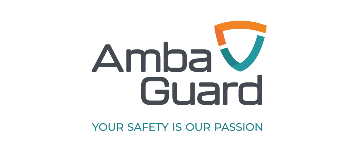
From 3 concepts, a preferred logo mark was chosen. It is inspired by a knight’s shield representing protection, with the safety tick of approval incorporated within the shield. The soft curves of this logo mark and font selection convey friendly and open communication. This was the best logo design to reflect the new brand positioning for AmbaGuard.
The Colour Palette
The colours were inspired by some of the mood boards from the briefing process along with the ‘amber’ reference in the new business name. The different layers of colours represent the layers of professional services AmbaGuard offer to their customers.
The darker graphite grey is a strong contrast to the amber and teal and also creates a mature and premium feel for the brand.

Brand Imagery
When devising a look for the AmbaGuard brand we were inspired by their value proposition. Imagery that represented personal passion, combined with professionalism of the highest safety standards. To help make the imagery more ‘ownable’ we looked for imagery that had teal-coloured tones with vibrant highlights of ‘amber-based’ colours. This creates a more cohesive feel to the imagery giving it a sense of being part of a branded family.

The work that you’ve done with our branding is amazing. The amount of depth that you went into.
We are super happy with the outcome. The process was easy to follow, you guys were there every
step to help us.”
Paul Mennen – AmbaGuard


